


The Reading-Speed Problem
Pitch deck design is usually framed as a polish job, the thing you do once the story is written and the numbers are in, but the guidance from Y Combinator suggests that this framing misses the point entirely because a deck is a clarity problem first and a design problem second. The question founders ask, does design help you raise, has a more useful version according to that guidance: does the design of your deck make your business understandable to an investor who has never seen it before, in the few minutes of attention they are willing to give. The goal is not to have the investor understand your whole business but rather to make them interested enough to ask follow up questions, and design is what determines whether you win that bet or lose it.
How investors actually read decks
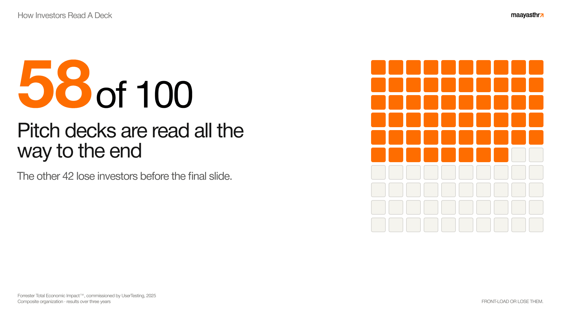
DocSend's analysis of pitch deck activity gives us a clear picture of how investors behave on a first view, showing that they spend on average somewhere between two and four minutes on the entire deck. The original DocSend and Harvard study landed at three minutes and forty four seconds, while more recent DocSend analysis puts the average closer to two and a half minutes. Either way, that works out to roughly twenty seconds per slide, and only about 58% of decks get viewed all the way through.
Y Combinator's public guidance emphasizes that founders dramatically overestimate how much attention their deck will receive because investor attention is a limited resource that must be spent wisely, and investors should be able to glance at each slide and immediately understand the point being made. For a fifteen slide deck, the reading window is about as long as making a coffee, and four times out of ten the reader stops before the end, so your job is to make the scan land the story anyway. The advice from Y Combinator explicitly recommends keeping decks to ten or twelve slides maximum because shorter decks force clarity and respect the investor's limited attention span.
This is where design earns its place, because a well designed deck lowers the cognitive cost of understanding each slide so that the reader covers more ground in the same minutes and reaches the part where they decide to take a meeting. Founders should strive for clarity and concision above all else, and the aim is to buy a complete read from someone who never planned to give you one.
Three rules for deck design
The principles of effective pitch deck design can be distilled into three simple rules that any founder can apply without a design background: slides must be legible, simple, and obvious. Legible means that even people sitting at the back of a large room can read the text, which requires large type, bold text, a simple font, and good contrast from the background. If investors cannot read your slide, they will never understand your idea.
Simple means that each slide expresses exactly one idea and not multiple ideas intertwined together. The word complex shares a root meaning braided or twisted, so simple ideas are ones that are not intertwined with other ideas. A simple slide therefore expresses one idea, and if you need to make more than one point, you should use more than one slide. This is why effective pitch decks treat each bullet point from your narrative as its own slide.
Obvious means that the slide can be understood at a glance. The simple test is to show the slide to someone unfamiliar with your business and ask them to tell you what it means, and if they do not immediately say your idea, the slide has failed. Obvious slides are fast to understand, which matters because investors are easily distracted and will check their email if they do not get your point right away.
Why screenshots and complex diagrams fail
A common mistake in pitch decks is the inclusion of screenshots, which almost always violate all three rules of good design because the text in most interfaces is too small to be legible, most interfaces do multiple things which makes the slide complex, and most screenshots take longer than a glance to understand.
Instead of showing screenshots, the better approach is to show the most simplified version of what you do, often using a bulleted list of steps or a simple diagram that makes one point clearly. The same principle applies to complicated diagrams, which create little mazes for ideas and make the path to understanding too long for a time poor investor.
The title slide is your first impression
The title slide of a pitch deck has a specific job that many founders get wrong. It should contain your company name and a one line description of what you do, written in plain English that a layperson can understand. Saying something abstract like reinventing agriculture is a failure because it gives no concrete information, while saying we build and operate robot greenhouses is immediately clear. You should start with the name of your company and what it does, using the simplest language possible, and the description should be like baby food rather than a complex meal. There is no need to set up the problem or make your idea sound impressive. You can simply get to the point.
Problem and solution slides work as a pair
The problem slide and the solution slide in a pitch deck must work together as a matched pair. The problem slide should outline a specific problem that your product actually solves, not a massive vague problem that no single startup could possibly address. The problem should be presented from your customer's perspective, showing how the world currently works with concrete examples rather than abstract claims.
The solution slide then shows how you change that experience, ideally with a side by side comparison that quantifies your impact with real numbers. Do not just tell investors that you have the fastest or easiest product on the market; actually show them numbers around the speed, ease, or price of your product compared to the way things worked before.
One idea per slide as a discipline
The single most useful discipline in deck design is committing to one idea per slide, which sounds obvious until you watch how often a slide tries to carry the problem, the market, and the product all at once because the founder did not want to add another page. A simple slide expresses one idea, and ideas that are simple are easy to understand. Splitting a crowded slide into multiple clean slides feels like padding yet it does the opposite because it speeds the reader up, as each page resolves to a single takeaway that they can absorb and move past. The deck gets longer but reads faster, and this trade is almost always worth making. A well constructed pitch deck should aim for ten to twelve slides at the seed stage, with Series A decks running to perhaps fifteen slides not including an appendix for follow up questions.
What belongs on the team slide
The team slide in a pitch deck should focus on the founders and why they are the right people to build this company, and at the seed stage no one cares about advisors. The team slide should show who the founders are, what relevant experience they bring, and demonstrate that they are able to hire the skill sets needed to execute on the vision.
If your team has a comparative advantage because of a successful prior exit or because you are one of the few people in the world uniquely equipped to start this company, then the team slide should move earlier in the deck. Otherwise, keep the slide simple and remove anything that is not directly relevant, including headshots for every employee and mentions of GPAs or past jobs that do not add credibility.
Where your design effort should go
It is tempting to pour the budget into produced visuals, custom illustration, animated transitions, and a heavily art directed look, but the evidence and expert guidance suggest that this is the wrong place to spend your effort. You should optimize for clarity and understanding, not beauty, and avoid anything that might distract from your main point. The most common culprits are fancy complicated diagrams that are hard to understand and colorful images that look nice but do not help illustrate your point.
Investors invest in teams, not slides, and your slides should make your ideas more clear rather than distracting from what you are saying out loud. A deck earns the meeting on how fast and how completely its argument lands, and the most produced deck in the room is often slower to read than a restrained one, so restraint is the winning move. Spend the design budget on getting your story into the reader's head quickly, and treat heavy production as a finishing touch on top of a deck that already reads clean.
What a well designed deck earns you
A deck designed this way earns you the one thing every founder wants from an investor and rarely gets, which is a complete read given willingly by someone who started out skimming. You do not need to sound cool or have pizzazz; you simply need to be clear. The broader pattern holds well beyond the deck, as Canva's 2024 research found that 77% of business leaders said communicating visually had directly improved business performance. Clarity is a business advantage in any document that has to persuade, and a fundraising deck is the highest stakes version of that document a founder will build. Designed well, it buys you the read that gets you the meeting.


