


The Business Value of Design: How Good Design Shows Up in Revenue
The business value of design is one of the easier things to feel and one of the harder things to put on a finance team's spreadsheet because a founder knows the product that converts better tends to be the one that feels considered, and a marketing leader knows the campaign that lands carries a clarity the others lacked. The number underneath that intuition has been measured for years, and the recent figures are stronger than most executives assume. The reason design still gets filed under cost rather than return has less to do with whether design pays back and more to do with where the payback actually lands.
Why design looks like a cost
When a company commissions a new identity, a product redesign, or a website, the spend shows up in one tidy place as a line item, a quarter, and a vendor invoice, but the return behaves differently because some of it shows up as a higher conversion rate, some shows up as a shorter sales cycle, some shows up months later as customers who stayed, and some never touches the income statement at all while instead showing up as the candidate who took the offer or the investor who leaned in.
A cost that arrives in one place alongside a return that arrives in five different places is a measurement problem before it is ever a value problem. The instinct to treat design as discretionary comes directly from that mismatch, and the fix is to stop looking for design's return in a single number while starting to read it the way it actually behaves, which is distributed across acquisition, conversion, retention, and the team. That distribution is also why design compounds, because each stage it touches feeds naturally into the next.

The benchmark and what followed
The first study to put a defensible number on this was McKinsey's 2018 report titled The Business Value of Design, which tracked design practices against financial performance across medical technology, consumer goods, and retail banking. The top quartile of design led companies grew revenue thirty two percentage points faster than their industry peers over five years and delivered total returns to shareholders fifty six percentage points higher (McKinsey, 2018). That moment marked when design stopped being a matter of taste in the boardroom and became a matter of growth.
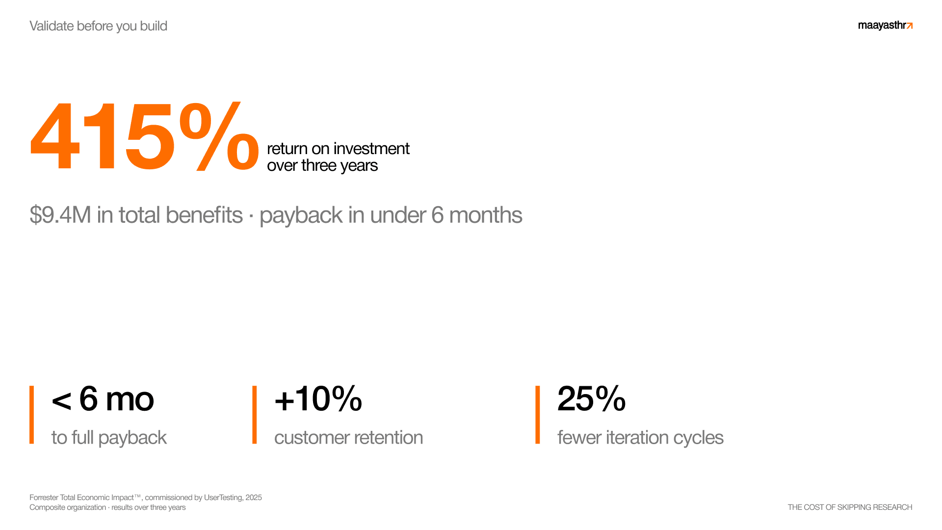
The numbers since then have only sharpened further. A 2025 Forrester economic impact study commissioned by UserTesting and modeled on a composite enterprise found a 415 percent return on investment over three years from building design validation into the product process, with a payback period under six months (Forrester, 2025). The same study attributed a 10 percent lift in customer retention to early design and usability testing, as well as a 25 percent reduction in iteration cycles to validating designs before development began. A payback measured in months from a category that most companies still defend as a cost is the headline worth carrying into any budget conversation.
A cost that arrives in one place and a return that arrives in five is a measurement problem before it is a value problem.
Where the return actually shows up
Walking through the sales funnel makes this distribution concrete. At the top of the funnel, design governs whether the work converts at all, and Adobe's 2025 analysis found that large enterprises connecting their creative teams to optimized tools and clear governance saw up to a nine times return over three years (Adobe, 2025). That return comes from the same mechanism that the Forrester study isolated, which is testing the design with real users before committing engineering to it so that the version which ships is the version that actually works.
In the middle of the funnel, design moves deals forward, and Canva's 2024 research showed that 90 percent of sales leaders said high quality visual assets accelerated their sales cycles (Canva, 2024). A shorter sales cycle is one of the cleanest pieces of design ROI that a finance team can read, because velocity is already a number that the revenue organization tracks, and better materials close the same deal sooner while sooner means real money.
At the bottom of the funnel, design keeps customers, and the 10 percent retention lift from the Forrester study lands squarely here. Retention is where design quietly does its heaviest financial lifting because a small and durable improvement in retention compounds across the entire customer base for as long as those customers stay, which is why an interface that feels clear and trustworthy returns far more than the redesign cost over its entire life.
Pricing power and the premium
There is a return that sits above the funnel and touches all of it, and that return is what a company can charge for its products and services. Considered design changes the perceived value of the thing being sold, and perceived value is what ultimately sets a price ceiling. In Canva's 2024 research, 77 percent of global business leaders reported that communicating visually had directly increased business performance (Canva, 2024). Part of that performance is the permission that a polished product gives a company to price with confidence rather than anxiety.
This is the return that enterprise leaders feel most directly and measure least often, because a premium price that is defended by a premium experience protects margin on every unit sold indefinitely. It rarely gets attributed to the design work that earned it, since by the time the pricing power shows up, the redesign is already two budget cycles in the past. The attribution gap is real, but the value is too.
The returns that never reach the income statement
Two of design's largest returns sit off the profit and loss statement entirely, and they are worth naming honestly as signal value that the business still feels. The first return is hiring, because strong designers, engineers, and operators read a company's product and identity as evidence of how that company works. A considered product surface signals that the company has taste and standards, and people who care about their craft want to build alongside other people who do as well, so the design becomes a recruiting asset that works while everyone sleeps.
The second return is fundraising, because investors give a first view deck only a few minutes of attention, often well under a minute per slide, and many decks lose them before the end. When that thin slice of attention decides whether a conversation continues, the clarity and craft of how the story is presented carry real weight, which means design earns the meeting where the round gets raised.
Design earns the meeting where the round gets raised.
How to measure design's impact in your own business
The reason design's ROI feels unmeasurable is that companies try to measure all of it at once across a distribution that resists any single number, and the way through is to stop trying to capture the whole return while instead instrumenting one stage at a time. Start by picking the single funnel stage where design most plausibly moves a number that you already track, which for a product led company is often activation or conversion, while for a sales led company it is more often cycle length or win rate. Choose the one place where a design change touches a metric that the business already reports, because that is where attribution will be cleanest and the result hardest to argue with.
Then baseline that metric honestly before you change anything. Write down the current conversion rate, the current cycle length, or the current thirty day retention, because a measured before state is what turns a redesign from an act of faith into an experiment with a clear result. Change one design variable and hold the rest steady, such as reworking the onboarding flow or the pricing page or the deck, and resist the temptation to ship five improvements at once since five changes give you a result that you cannot attribute to any single action. One change against a clean baseline gives you a number that you can defend in a budget meeting.
Watch the metric that sits closest to the change first and then watch the ones downstream, because a clearer pricing page should move conversion this month and may move retention next quarter as better fit customers arrive. Reading the near effect and the far effect separately is how you see design compounding rather than crediting it once and moving on. Do this two or three times and a company stops debating whether design pays back and instead starts knowing its own number. That number will be specific to the business, which is the point, because the studies tell you that the return is real and large while your own instrumentation tells you how large it is for you, and that figure is what wins the next budget conversation.


