


Design as a Competitive Advantage: The Moat That Compounds
The differences that used to set companies apart are getting easy to match. For a long stretch, a company could lead on a feature or a price and hold that lead for years. That is a harder bet now. A novel feature ships, and within a quarter a well-funded rival has shipped its own version. A pricing edge invites a faster follower to undercut it. Capability spreads through an industry at the speed of the best engineering team that wants to copy it, and most categories now have several of those.
What stays scarce is the quality of the whole experience. This is where design as a competitive advantage becomes the durable lever rather than the decorative one. When two products do roughly the same thing at roughly the same price, the buyer chooses the one that feels clearer, faster, and more considered to use. Design-led companies understand that the experience is the product, and they treat it as the thing worth winning. That is a position a competitor can see plainly and still struggle to take.
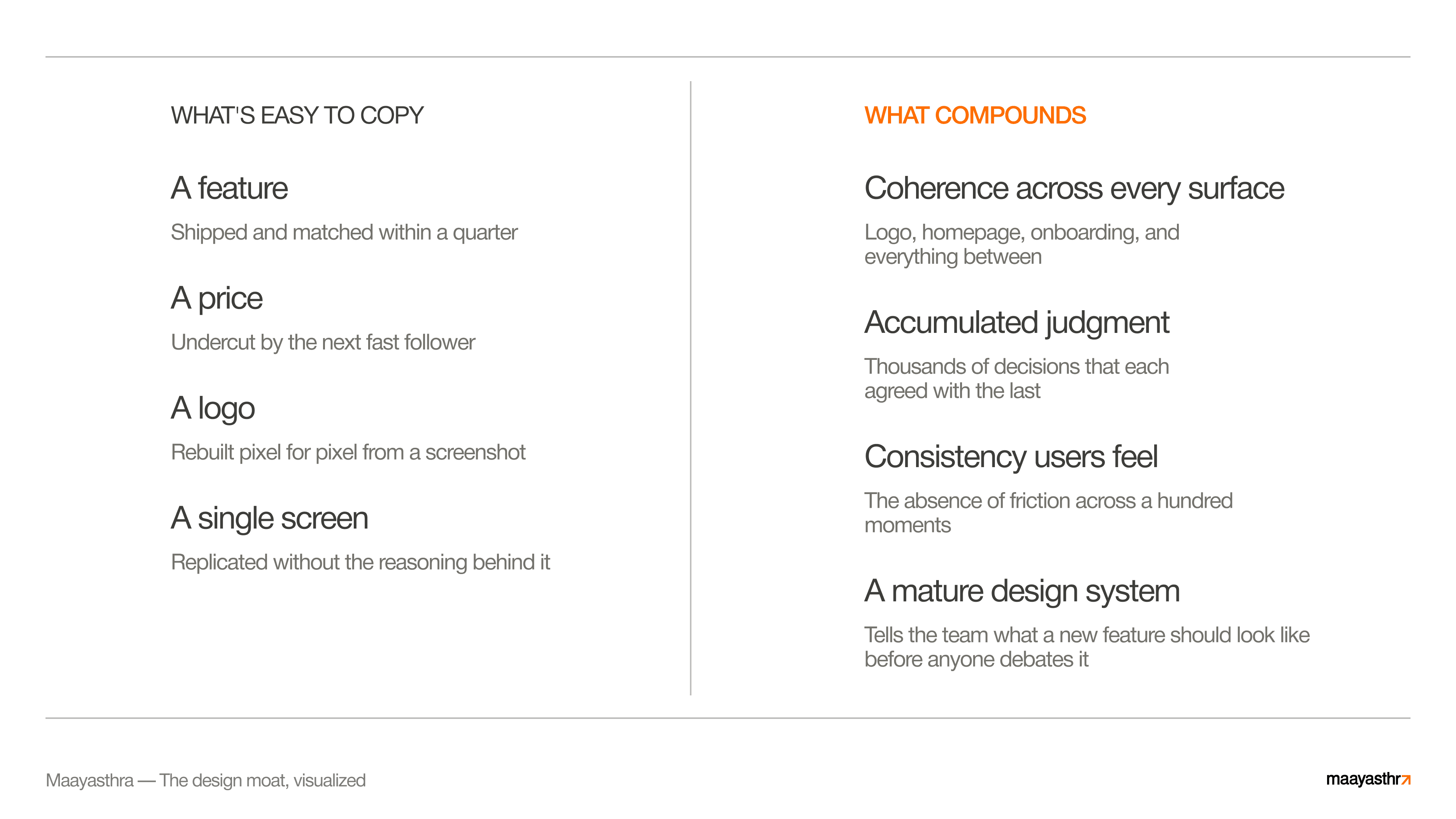
The advantage compounds where no one looks
A moat is the sum of every decision, and that is what makes it hard to take. Most discussions of design value skip this part. A moat built on design is the coherence and judgment running across the logo, the homepage, and the onboarding flow all at once, the result of thousands of small decisions that each agreed with the last.
That is exactly why imitators copy the surface and stop there. The surface is the only legible part. A competitor screenshots a pricing page and rebuilds it pixel for pixel. The reasoning that chose that layout over forty others stays behind, along with the standard that kept the rest of the product consistent with it and the taste that knew when to stop. Copy one screen and you have one screen. The judgment that produced the whole system stays with the company that built it.
This is the non-obvious spine of the whole argument. A founder or a product leader can usually point to the one famous artifact a rival is known for and assume that artifact is the advantage. The advantage is everywhere else. It is in the parts no one screenshots, the consistency a user feels without naming, the absence of friction across a hundred moments that each got the same level of care.
What competitors copy is the surface. The judgment underneath is what compounds.
The structural edge of design-led companies
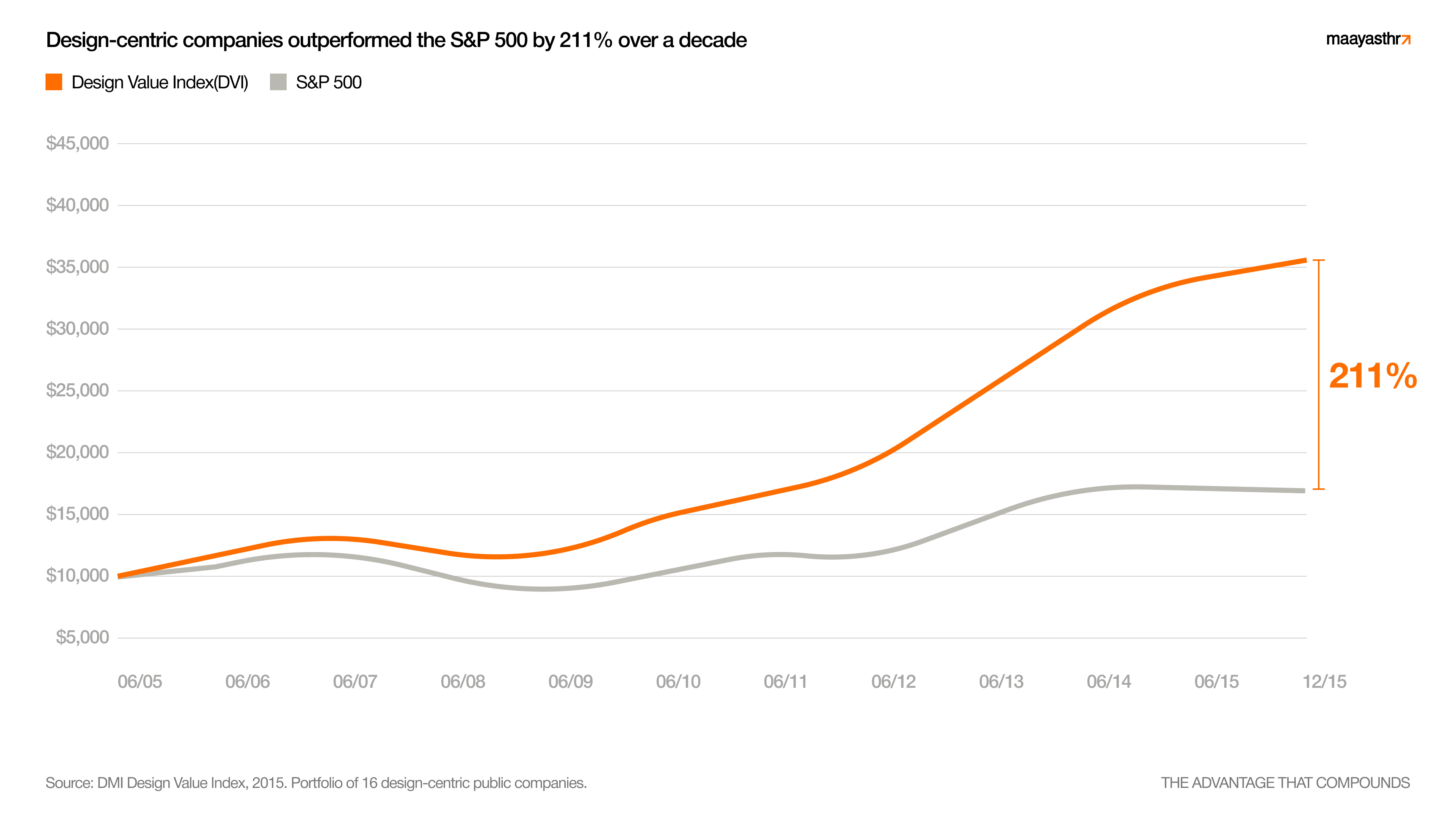
This holds up when you look at how design-led companies have performed over long periods. The DMI Design Value Index, an older index covering roughly 2004 to 2015, tracked a portfolio of design-led public companies against the S&P 500 and found they outperformed it by around 219% over that decade. We treat that figure as historical evidence rather than current-year data, and it is worth the weight precisely because it spans ten years. A short-term result can be luck. A decade-long gap across a portfolio reflects something structural about how these companies operate.
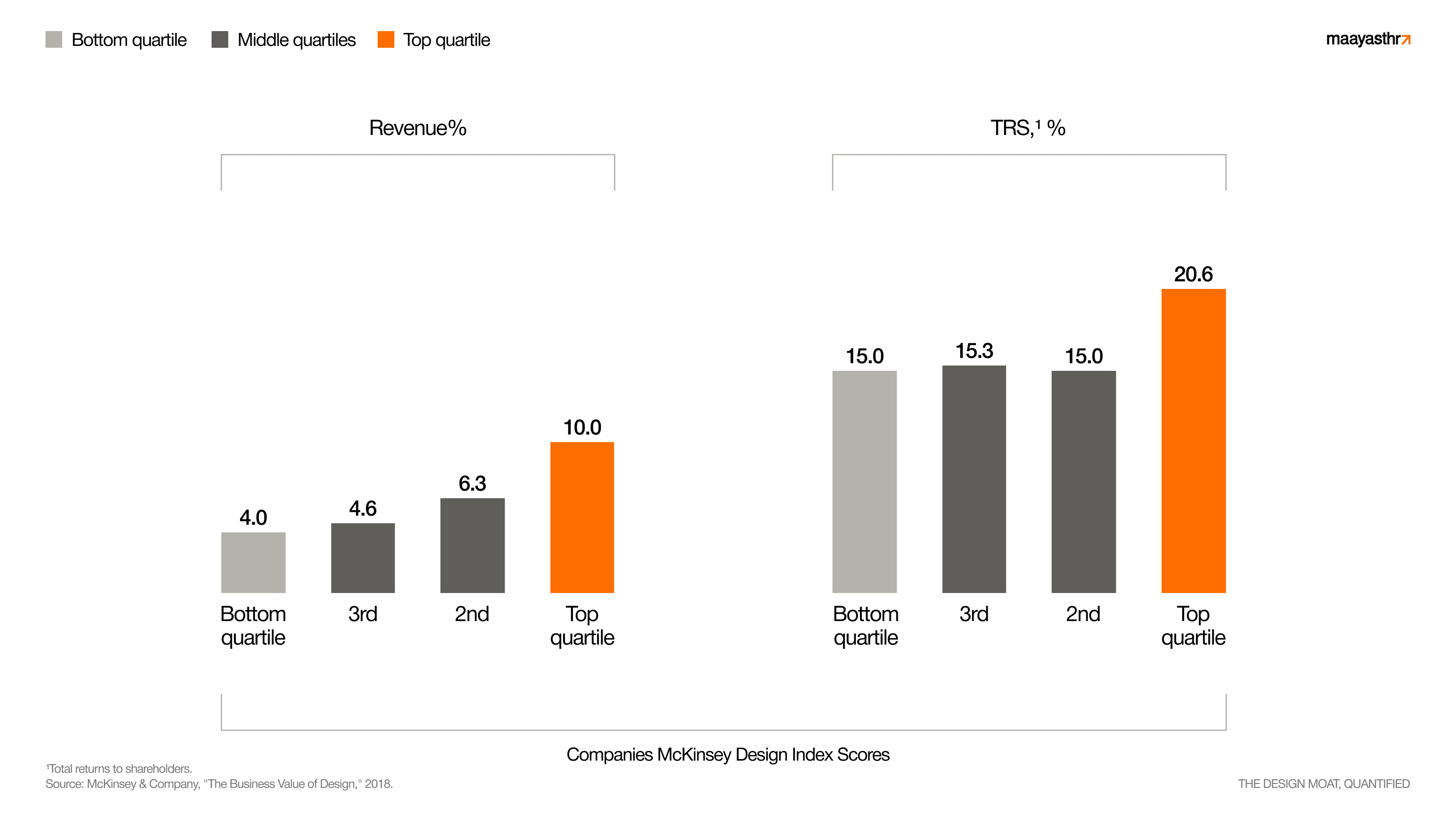
The 2018 McKinsey study that first put a clean number on this found the same shape in different data. Its top-quartile design performers grew revenue 32% points faster and delivered total returns to shareholders 56% points higher than their industry peers over five years, across medical technology, consumer goods, and retail banking. Two different methods, two different decades, the same direction.
The advantage reads as current, too. A 2025 Forrester economic-impact study, commissioned by a software vendor and built around a composite enterprise, put the three-year return on disciplined design and usability work at 415%, with payback inside six months. A 2025 Adobe figure put the return as high as 9x over three years for large enterprises that connect their creative teams to good tooling and governance. We cite these lightly and label them for what they are. The point they reinforce is simple: the compounding hasn't stopped. Disciplined design still returns more than it costs, and it still separates the companies that take it seriously.
Design Coherence is Your Advantage
Out-designed, in our experience, beats out-built more often than people expect. We will state this one as our own observation, because it is. In category after category, the company that won was the one that out-designed the field more than the one that out-built it. The underlying technology was often comparable across the contenders. The experience is where the winner pulled ahead.
Workplace messaging had functioning tools for years before Slack made the experience feel human enough that teams adopted it on their own. Design tooling existed before Figma made it collaborative and immediate in a way that pulled whole teams in. Notion and Linear both entered crowded categories and won committed users on the clarity and craft of the experience more than on a feature no one else could build. Each of these companies won on the coherence of the whole experience, which is the hardest thing to copy. The function was always replicable. The coherence stayed theirs.
Apple and Stripe sit a level above as the standard the rest measure against. Apple's advantage was always the whole, built from decades of decisions that all agreed with each other, until the coherence itself became the thing competitors would need years of their own to assemble. Stripe did something similar for developer-facing software, where the documentation, the dashboard, and the API all carry the same considered hand. In both cases the moat is the consistency, accumulated over years, across every surface a user touches.
Why the moat gets wider the longer you build it
A design advantage has a quality most advantages lack: it strengthens with use. Every new decision made in keeping with the existing system makes the whole more coherent, and a more coherent whole makes the next decision faster and more obvious. The system starts doing some of the thinking. A mature design language tells the team what a new feature should look like before anyone debates it, which means the company ships consistency at speed while a less coherent rival relitigates the basics every release.
That is the compounding. A competitor copying your current surface is copying a snapshot of a system that has already moved on. By the time they match where you were, the accumulated judgment has carried you somewhere more coherent still. The gap behaves like a distance that grows while they climb, widening with every decision you make in pattern.
How to build design as an advantage that holds
If a moat is the sum of coherent decisions, the way to build one follows directly. Treat design as a standing capability rather than a project you commission once and file away. Give it a system, so the thousands of small decisions inherit the same standard instead of each starting from zero. Give it an owner with the authority to hold that standard across every surface, because coherence breaks at the seams between teams that each optimize their own corner. And give it time, because the whole premise of a compounding advantage is that it rewards the company that keeps building in pattern while others reset.
For a founder, that means investing in the experience as early as the product itself, so coherence becomes the default before the surface area gets large and hard to align. For an enterprise leader, it means defending the system against the fragmentation that creeps in as more teams ship more things, and treating consistency across surfaces as a competitive asset worth protecting. In both cases the work is the same: accumulate considered decisions, keep them in agreement, and let the coherence build.
That is the moat. It is the one a rival can study in full and still struggle to take, because what they would have to copy lives across every screen at once, and in the judgment that kept them aligned. Build that, keep building it, and the advantage widens on its own.


